Niederrhein Energie und Wasser GmbH, headquartered in Mönchengladbach, is a regional driver and innovator in the fields of energy, water, mobility, public transport and public baths. With a clear vision, the company has been developing toward the future for around ten years and is a highly committed and attractive employer that is serious about digitization.
Strategic positioning and development of the new brand design for the NEW corporate brand.
In the course of finalizing the brand design, CHIARI was also commissioned to develop the new corporate design for the regional energy group.
While working on the corporate design, CHIARI continued to be commissioned by NEW to develop and implement the brand launch campaign.
Idea
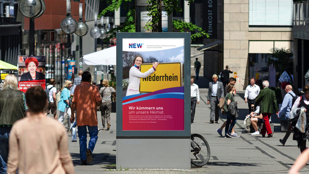
As a result of the merger of NVV (Niederrheinische Versorgung und Verkehr AG) with Niederrheinwerke Viersen, NEW is the largest basic supplier in the Lower Rhine region.
The differing color waves stand for the continuous flow of electricity, gas and water and, of course, the Lower Rhine itself – as the lifeline of the region. In addition, this is also a way of visually uniting two providers who will in future be uniting their services under one corporate umbrella.
Solution
The new logo communicates the core values of the new brand visually and in terms of content: regionality, innovative strength and partnership.
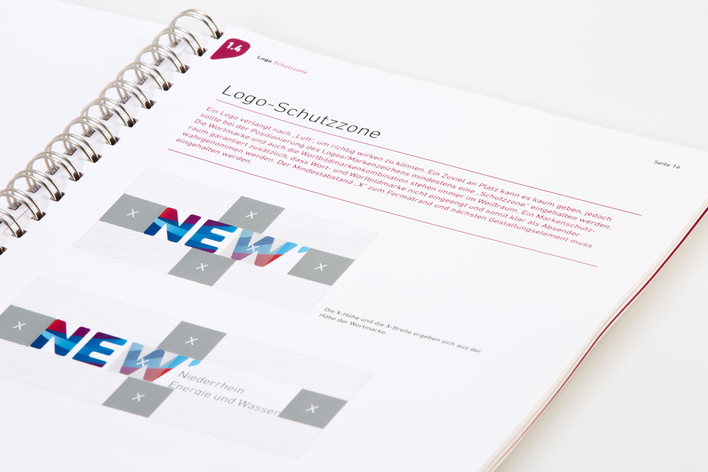
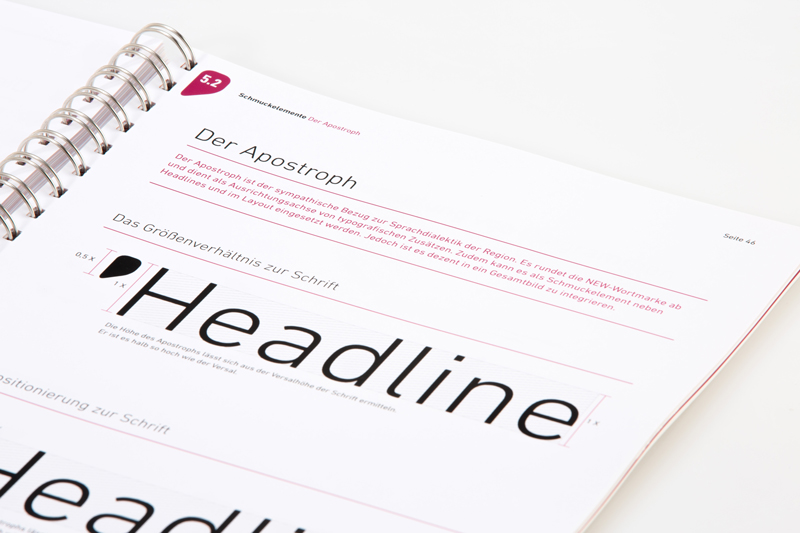
It is based on a word mark that characterizes a stable provider and ends with an apostrophe that sympathetically quotes the Lower Rhine dialect.
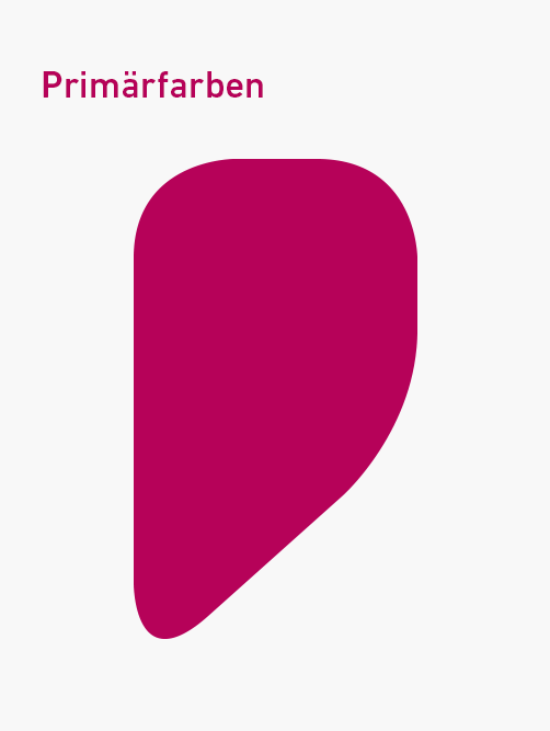
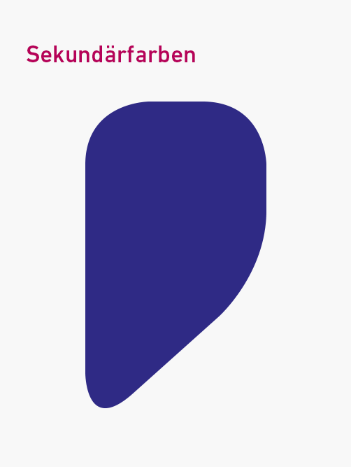
The color scheme developed for the word mark consists of active, emotional red tones and confident, dynamic blue tones.
Colors
NEW has a concise and balanced color spectrum that is used consistently in all media.
Brand energy in color and shape
The color scheme reflects the liveliness and innovative power of the NEW brand. It allows a high variability in the application and can be used with different weights.
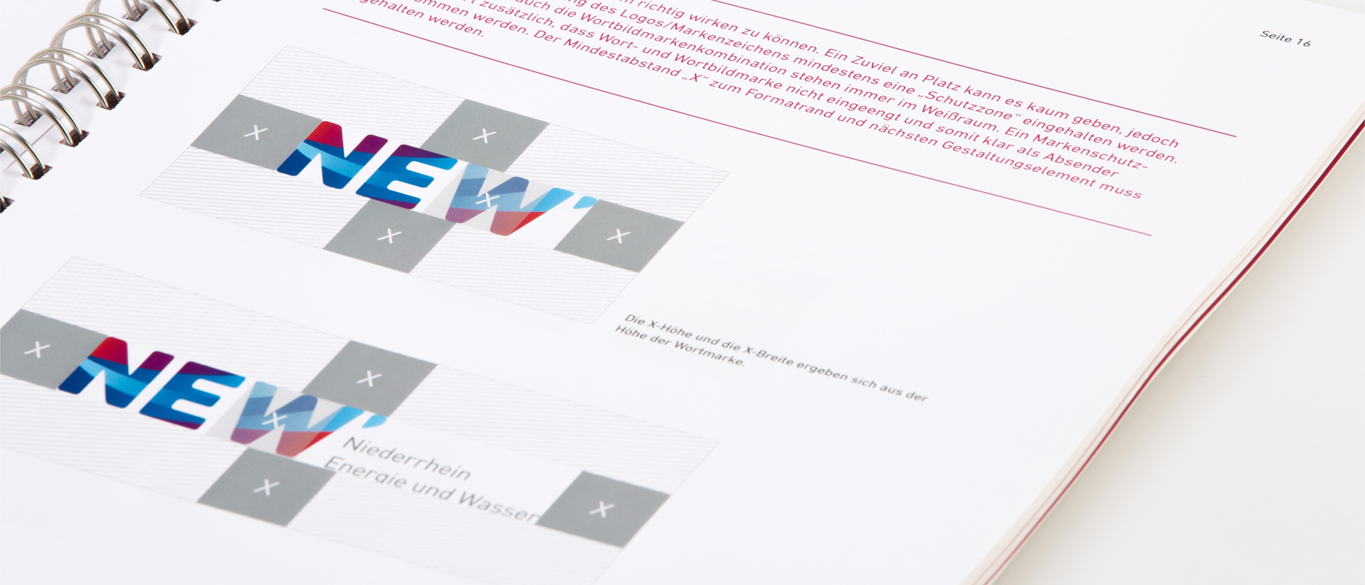
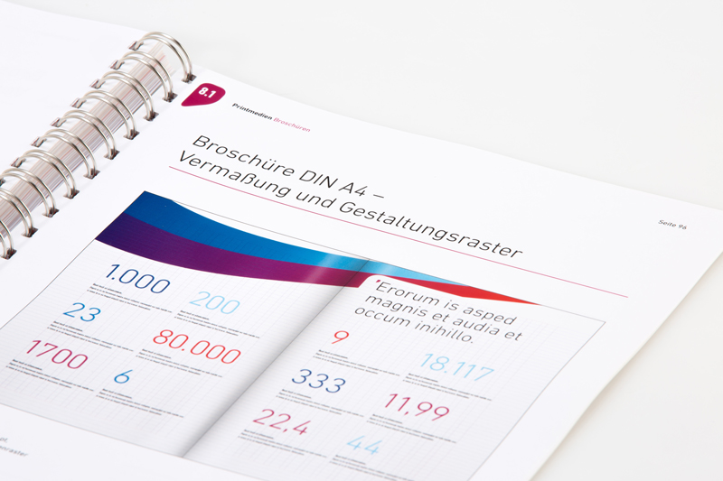
The design grid is highly adaptive and enables consistent design work across all formats and channels. The mix of systematic structure and liquid usability serves for all application types as a design code.
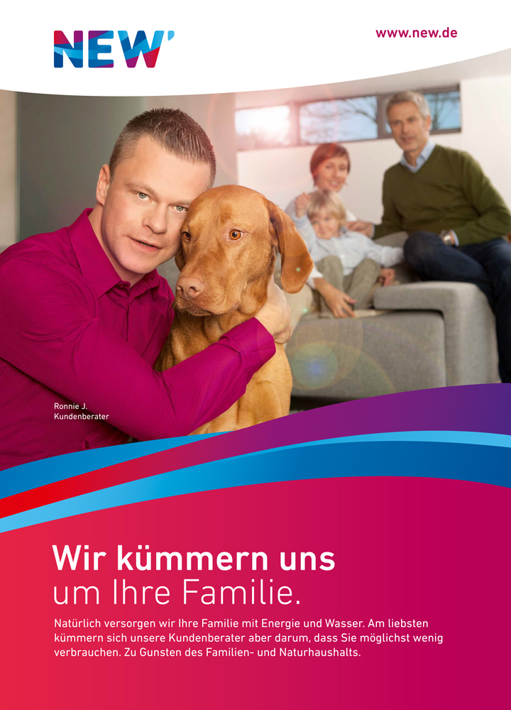
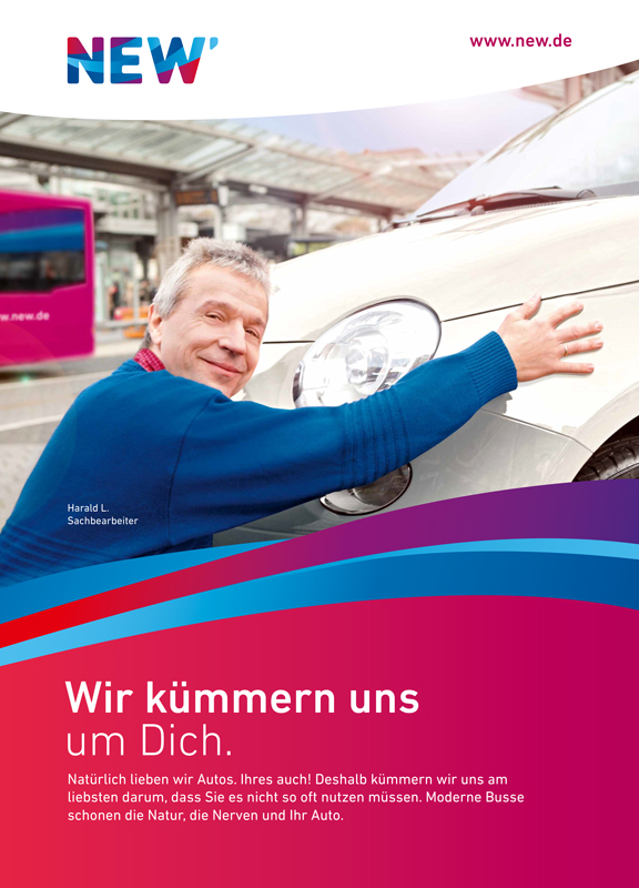
A region sees (berry) red
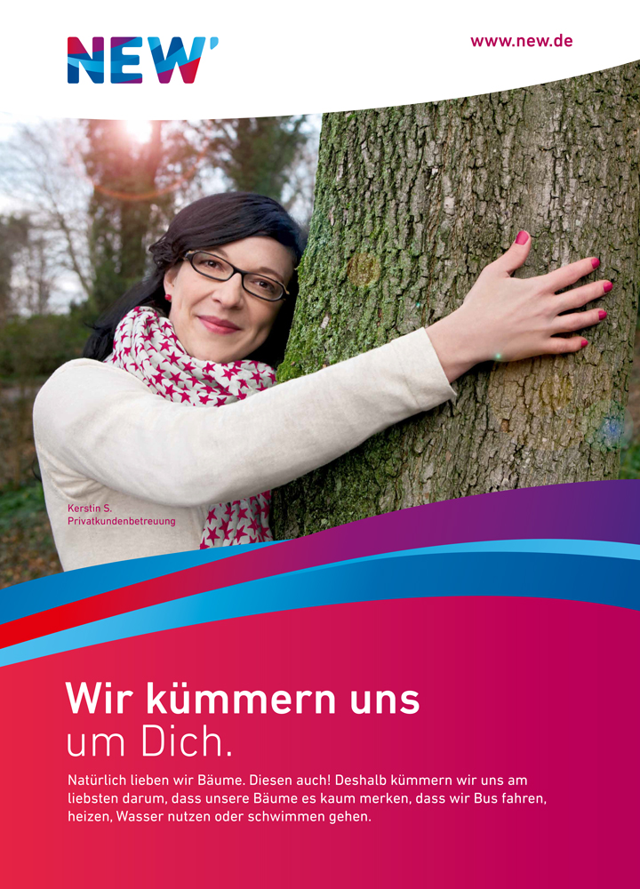
A hug is an expression of care, of responsibility as well as of familiarity and is a sign that something is especially close to your heart and that you care.
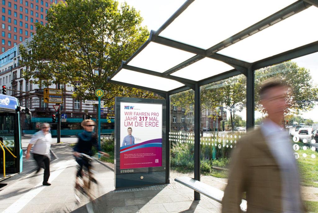
With this strong image, the brand launch took place throughout the supply area as part of the launch campaign. The figurative metaphor was used to launch the new brand claim "We care" and bring the new brand image to life.
At the peak of the campaign, the region literally saw (berry) red, as the immense presence of NEW buses and OOH activities meant that the brand color berry red visually dominated the cityscape with a high degree of penetrance.
After the very successful brand launch of NEW, we also developed the employer brand campaign "New Perspectives", which was advertised with a catchy headline concept for NEW as a strong employer in the region.