A Munich-based investor with a strong commitment to asset and financial consulting gave us the task of developing a name, corporate identity and a few, but all the more exclusive, communication tools for a newly founded holding company that primarily operates as a venture capitalist for start-ups. The name “SVART”, which we developed in a five-step process and which was finally selected by the client, comes from the old Germanic language and means “black”. It is concise, shows strength and can be used both nationally and internationally. SVART associates terms such as smart, start, SWAT, sword and documents the commitment and financial strength of the company owners.
As a word-picture mark, the logo also reflects this energy – the central letter "A" becomes an abstracted rocket that also visually integrates the theme of energy boost and #StartUp. Since SVART Ltd. is engaged only in the high investment area, the company owners attached great importance to the very highest quality in the production of business cards, stationery and notepads. The personal, perfectionist claim should also be found here.
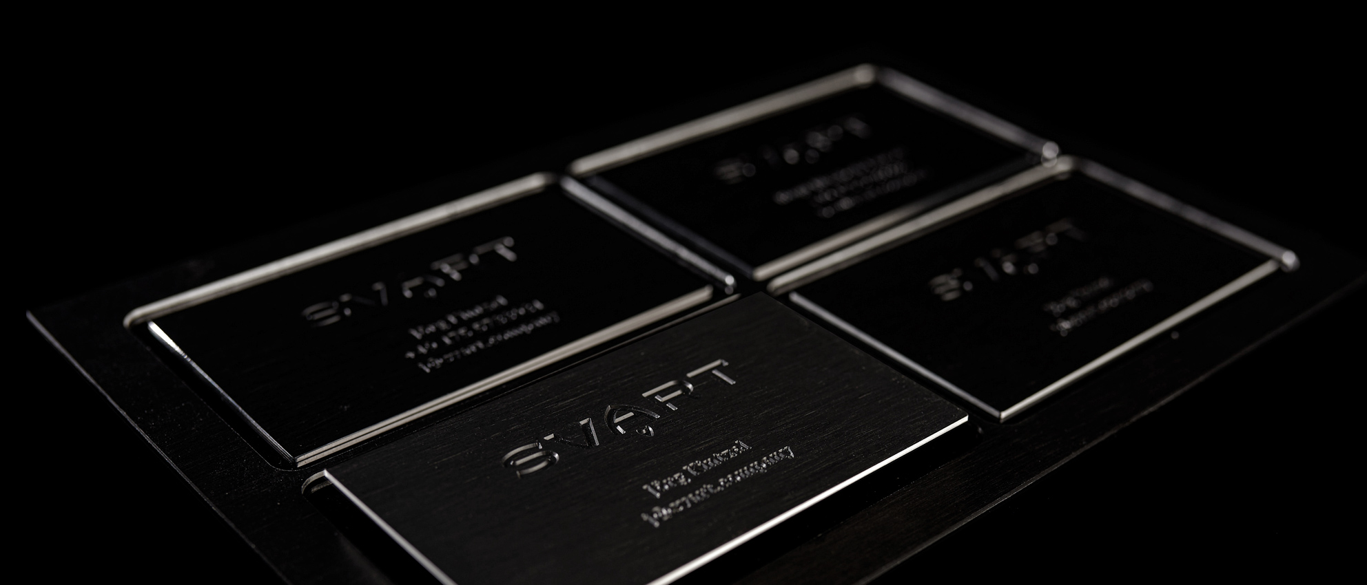
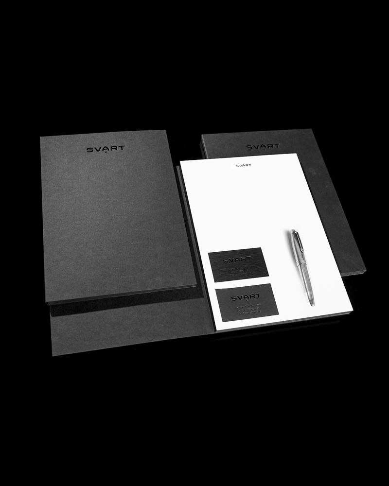
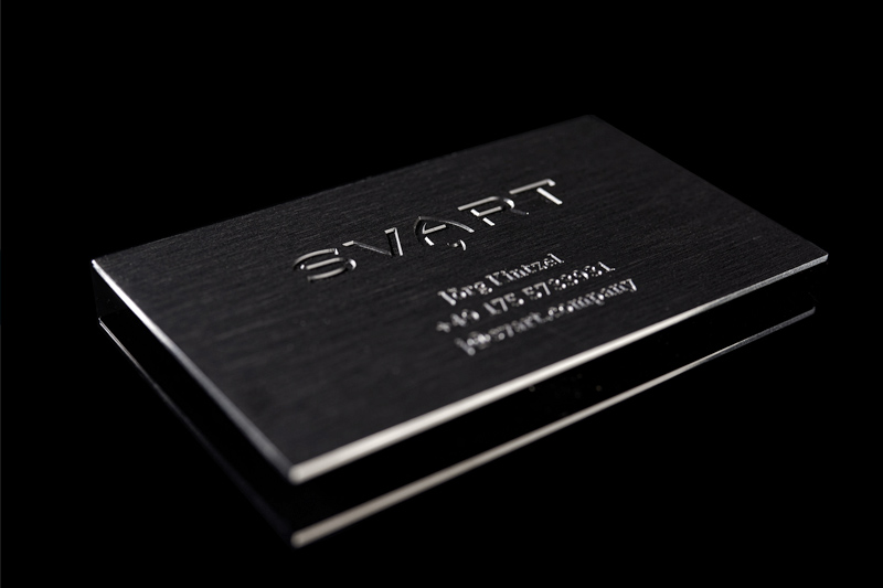
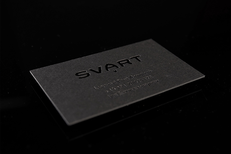
The result
Unique solid aluminum business cards engraved, ground, anodized black on both sides, milled out and hand polished to mirror finish on edges. In addition, the highest quality stationery, printed in double black, bookbinded as a notepad with surrounding black cut cate in the blackest cardboard masterfully bound, the logo with black foil deeply embossed on the front.
The value and at the same time appreciation of the counterpart when handing over such a business card can not be emphasized strongly enough in the age of arbitrary "we exchange our contact details via WhatsApp or mail attachment"...