![]()
Domivara Real Estate
Positioning, brand and corporate design
A piece of heritage for the present day
Domivara did not want to be just another real estate company. No loud estate agents, no transaction-driven sales model, no interchangeable brand aesthetics. The aim was to find a positioning that did not view real estate in isolation, but rather in the context of the market, usage, financing and real life. A brand with attitude – calm, structured, responsible.
Our task: strategic refinement, brand architecture and a corporate design that visually conveys this attitude.


The brand idea
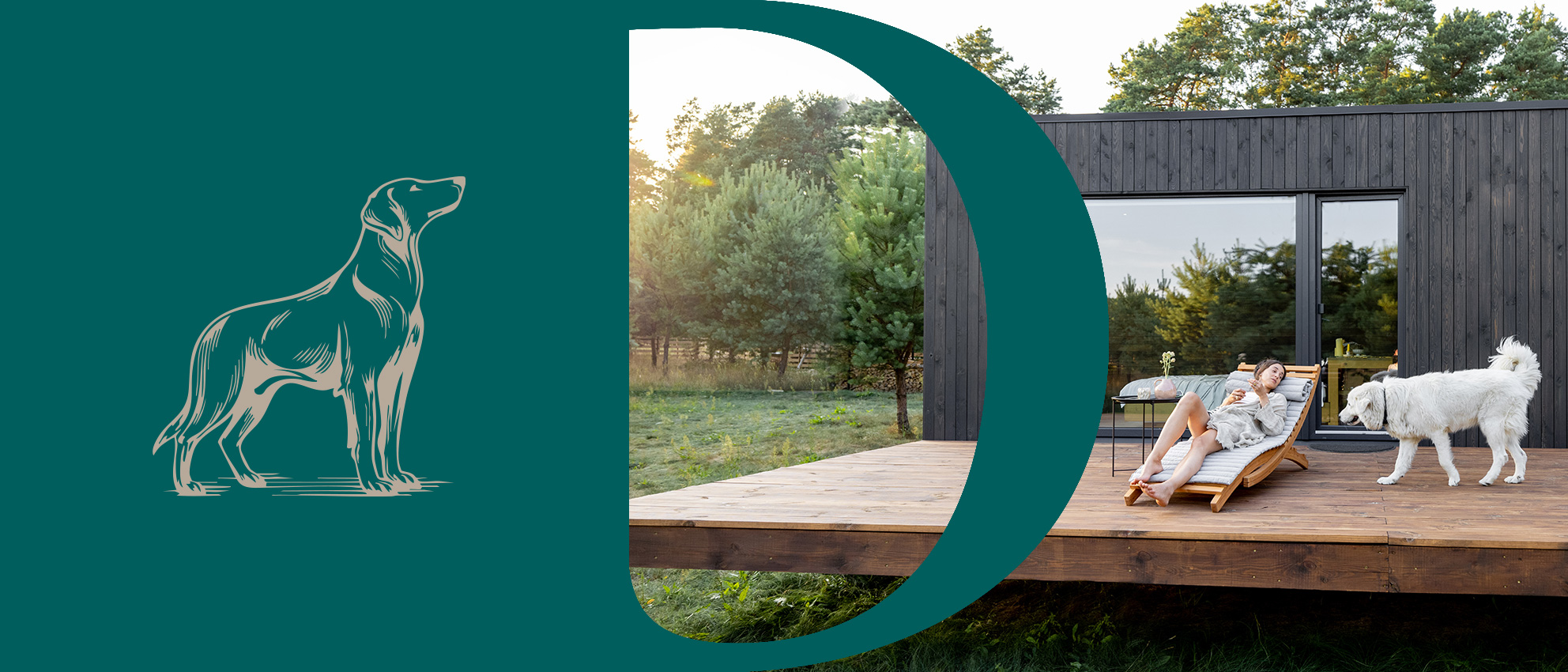
The motif of the ‘guardian’ is at the heart of brand development.
The dog, symbolising vigilance, loyalty and reliability, became the brand’s central metaphor – not decorative, but conceptually anchored.
Domivara sees itself as a companion with an overview. As a partner that does not push, but rather classifies. As an authority that prepares decisions in a structured manner instead of rushing them. This attitude forms the basis for language, design and user guidance.
Stability with character
The logo translates this idea into a calm, timeless design language. The dog appears clearly contoured and evokes a copperplate engraving, reduced and confidently positioned. No effects, no fashionable exaggeration. Instead: presence through posture. The defined protection zone and clear proportions ensure effectiveness in both digital and analogue spaces. The symbol is flexible in its application yet unmistakable.
![]()
![]()
A range with substance
The colour palette has been deliberately reduced and developed to reflect the materials used.
Beige and brown tones represent grounding and closeness.
Green and blue bring depth, trust and structural clarity.
Combined, they create a calm tension that conveys seriousness while allowing warmth. The colours do not appear trend-driven, but rather mature – in keeping with the brand’s long-term perspective.
Domivara
Beige
Domivara
Light brown
Domivara
Dark green
Domivara
Dark blue
Clarity in detail
With Miller Display Roman and Brother 1816, Domivara combines precision with character.
The serif font conveys confidence and calm. The sans serif font creates structure and legibility. Typography is used functionally: it guides the reader through the content, structures complex relationships and supports the clear, authoritative tone of the brand.

The right
decision for
your property.
Private owners · Investors · Property developers · Project developers · Property seekers
An initial design element
The abstracted ‘D’ became a recurring, initial design element.
It stands for decision, discipline and distance from the superfluous.
As a framing element, it directs the eye, creates recognisability and connects analogue and digital applications into a consistent system.
Stand out – but discreetly and with style.

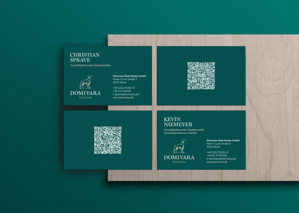
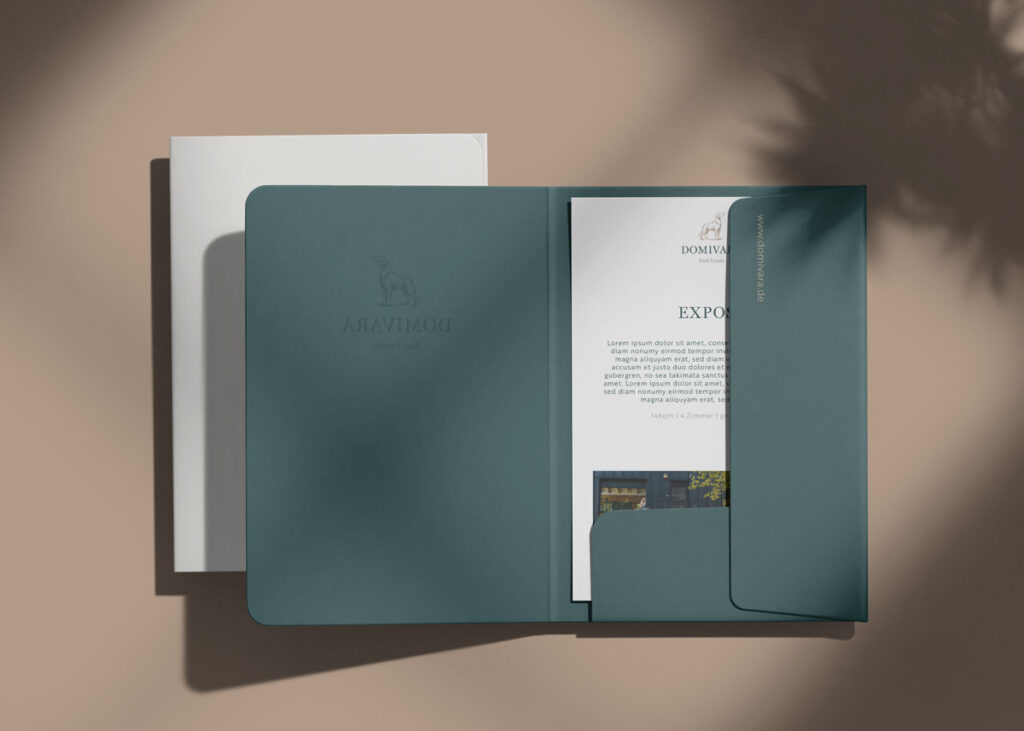
Attitude in application
Business cards, presentation folders and business stationery translate brand values into tactile quality. Materiality and colour schemes intertwine and are made unique by a personal touch, such as specially bottled rum.
The design remains minimalist, high-quality and structured – without being an end in itself.

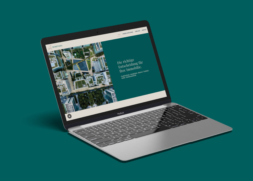
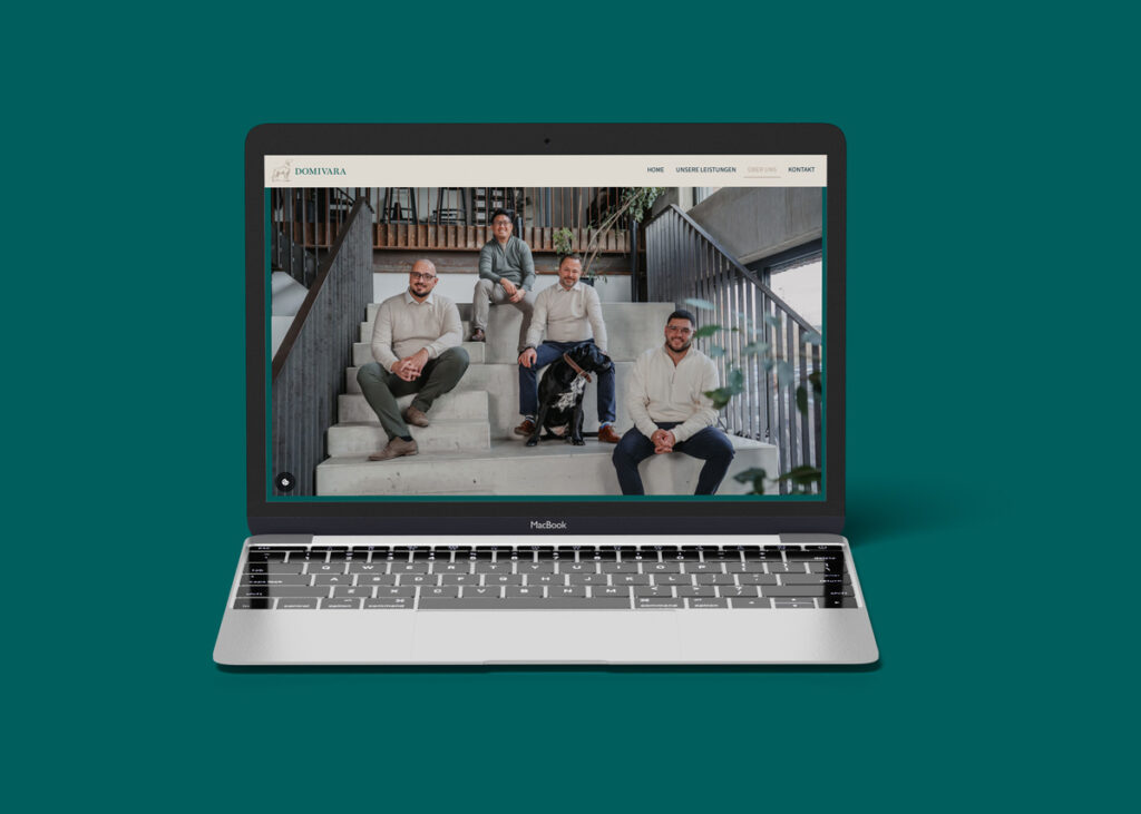
Structure as user guidance
The website continues the principle of clear decision-making. Reduced colour areas, generous white space and a structural typography concept create orientation. Content is not accelerated, but classified. Navigation follows target group logic: owners, investors, project partners.
The design supports the content structure here – not the other way around.