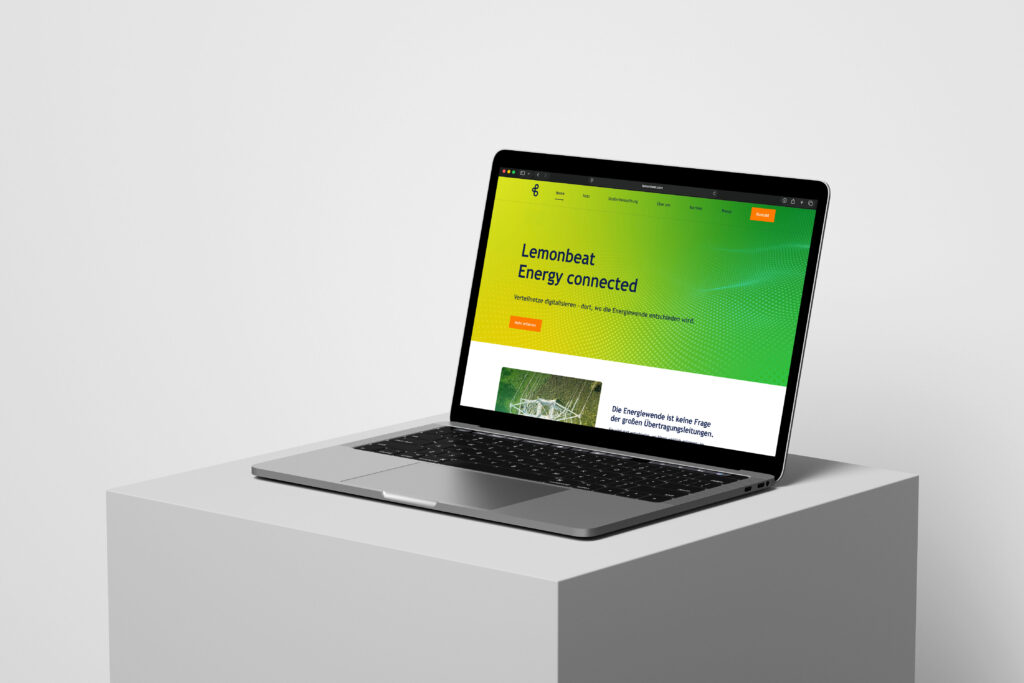
How do you develop a design identity that not only resonates today, but also works with the ways of working of tomorrow? For Lemonbeat, a specialist in smart IoT solutions and digital infrastructure, we have reimagined their existing corporate design. Not as a traditional relaunch, but as an evolutionary development with a clear goal: maximum recognisability with minimum complexity.
The result is the concept of a Brand Operating System (BOS): a modular design system that combines visual identity, clear guidelines for use and AI-supported workflows. This enables brand communication that not only looks good, but can also be implemented simply and efficiently.
The brand’s visual identity.
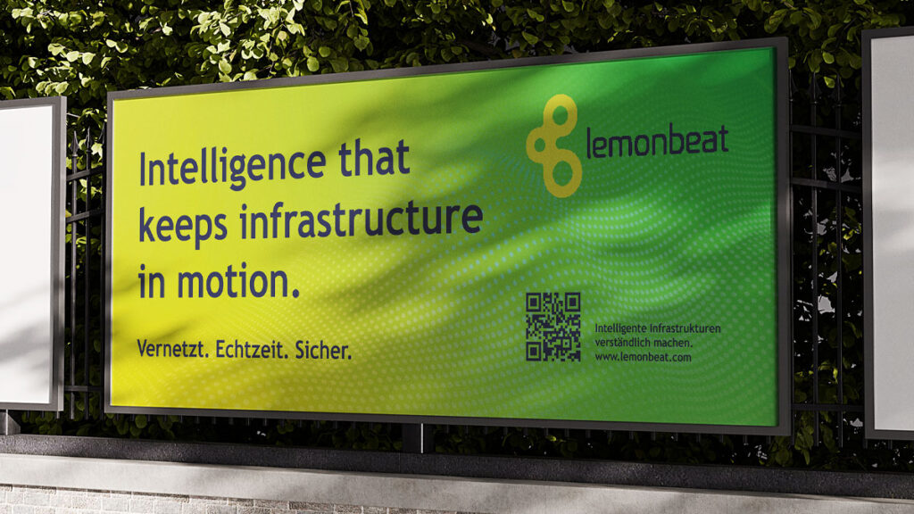
The existing identity serves as the starting point. We retain its distinctive features and develop them in a targeted manner. The logo is simplified for monochrome applications, the colour palette is refined and functional shades are added. This creates a distinctive, striking design language that reinforces Lemonbeat’s technological character whilst offering greater flexibility for both digital and analogue applications.
Orientation through colour.
Lemonbeat’s distinctive colour palette remains unchanged. Signal Lime, Grid Green and Infrastructure Cyan continue to define the brand identity. Complemented by Deep Blue, Fog Grey and Alert Orange, this creates a nuanced colour system with clearly defined functions. Optimised contrasts improve readability and enable accessible design. Colour thus becomes not only a distinguishing feature, but also a system for navigation.
Clarity begins with reading.
Modern technology doesn’t need complicated typography. With Trebuchet MS, we’ve opted for a universally available system font that combines character and functionality. It works without the need for additional licences in Microsoft Office, Google Workspace and AI-powered applications. A clear typographic system ensures consistent hierarchies and maximum practicality for everyday use.
Graphic elements
Structure requires order.
Drawing on the concept of interconnected infrastructure, we are developing a distinctive visual language. The ‘Signal Field’ translates invisible data and communication processes into dynamic spaces of colour and movement. The ‘Signal Flower’ complements the system as a linear, directional design element. Together, they create a distinctive visual identity without restricting communication to rigid layouts.
Technology needs faces.
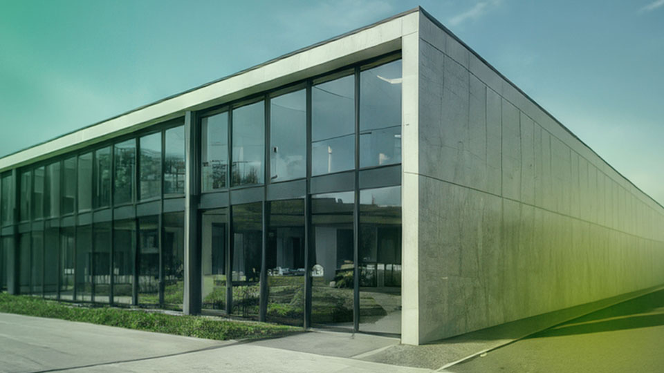
Behind smart technology are people. That is why the new visual identity combines technical precision with authentic, documentary-style photography. Real people, genuine work processes and infrastructure in action form the basis. Defined image presets and graphic layers make it possible to bring together your own photographs, stock images and supplementary image sources to create a consistent brand identity.
Daily use.
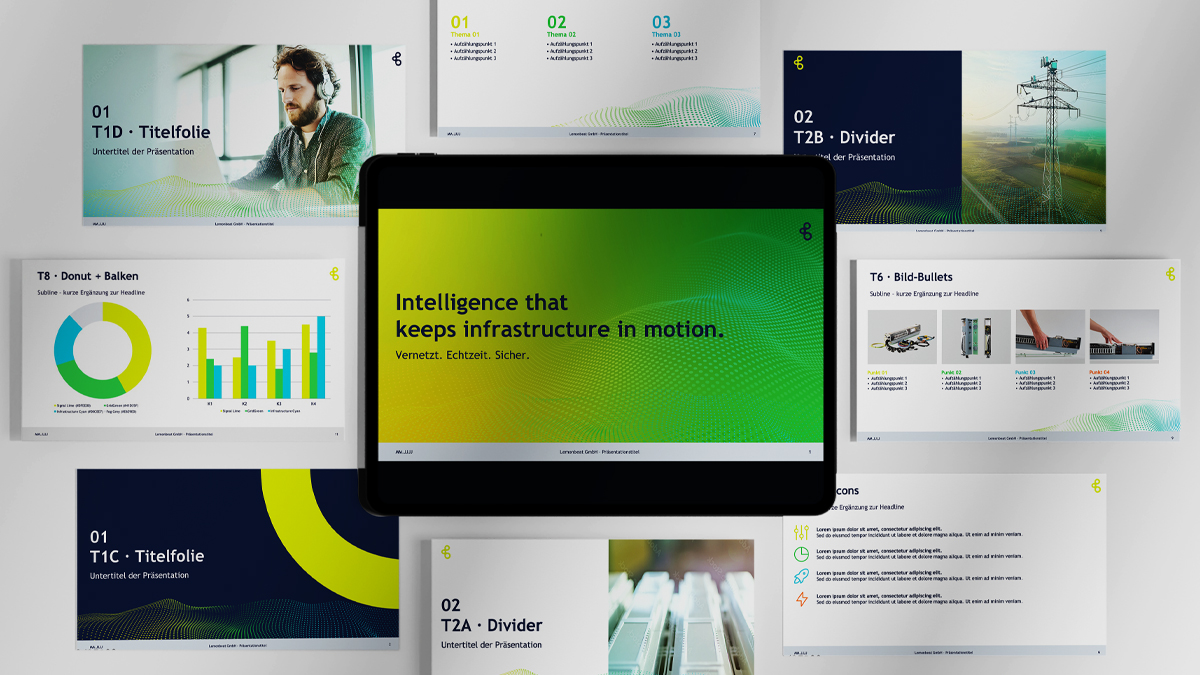
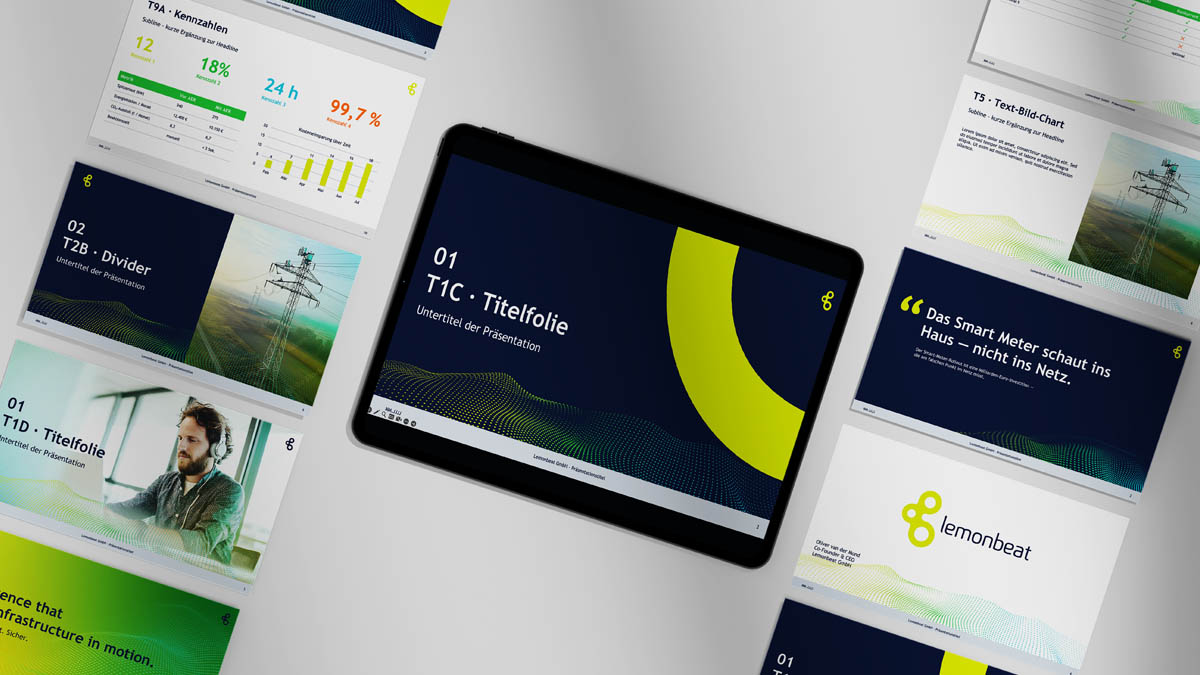
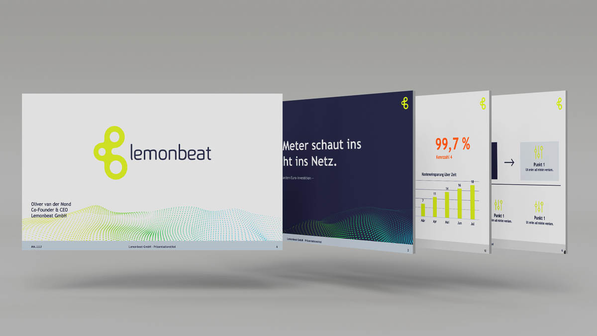
A design system is only as good as its implementation. That is why we conceive the corporate design as an AI-first system right from the start. Modular templates, defined design rules and a prompt guide lay the foundations for, for example, creating PowerPoint presentations efficiently and in line with the brand, with the support of AI assistants.
The system is designed to handle a variety of communication tasks, ranging from landing pages and corporate presentations to print and trade fair communications.
The result is more than just a new visual identity: it is an operating system that holds the brand together and simplifies its day-to-day communication.