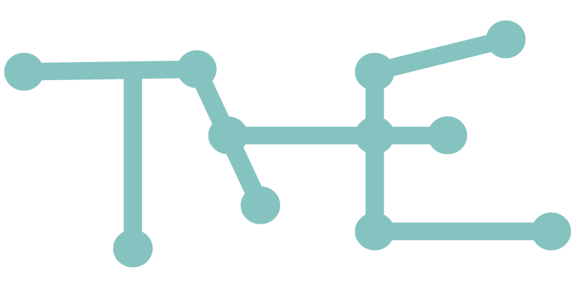
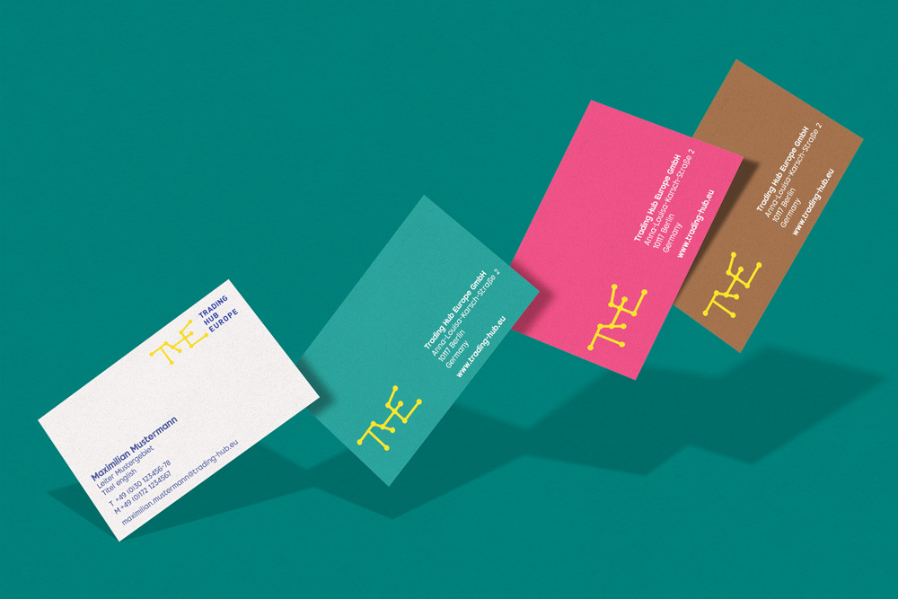
CHIARI developed the original brand and corporate design for Trading Hub Europe—or THE for short. With the 2025 refresh, we have comprehensively evolved the brand, transforming it into a modern, digital, and highly functional design system. The goal: a consistent, future-proof brand identity that is visually compelling and works intuitively across digital applications.
Clarity, structure and movement.
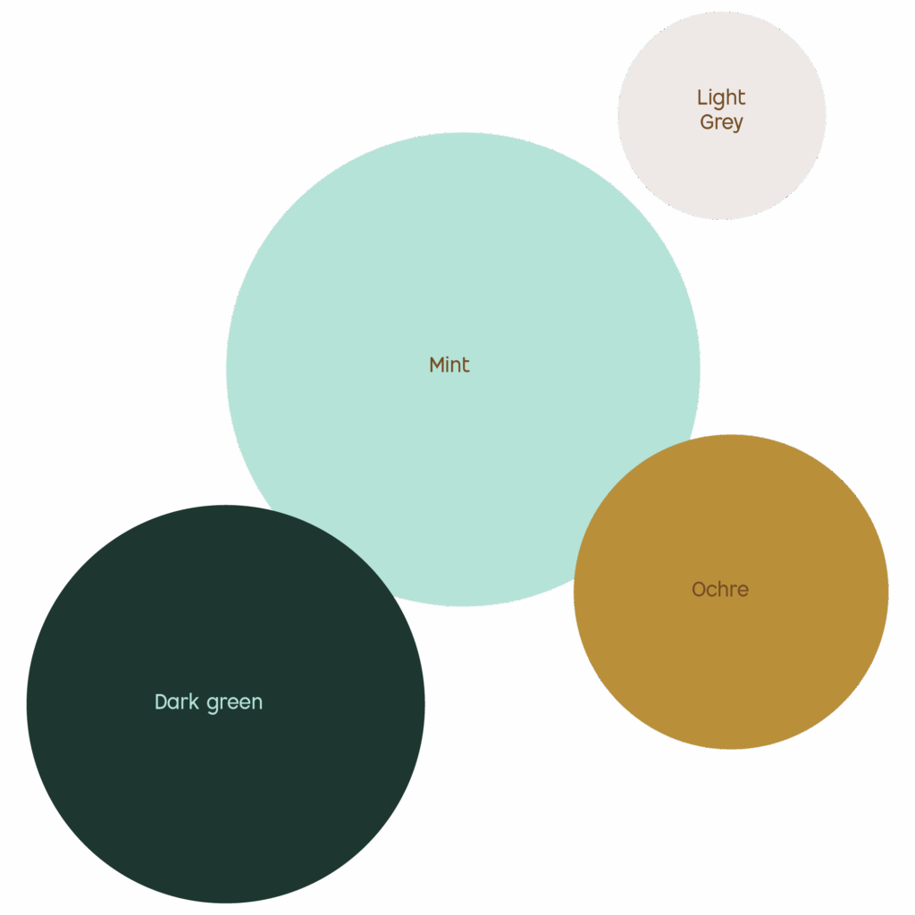
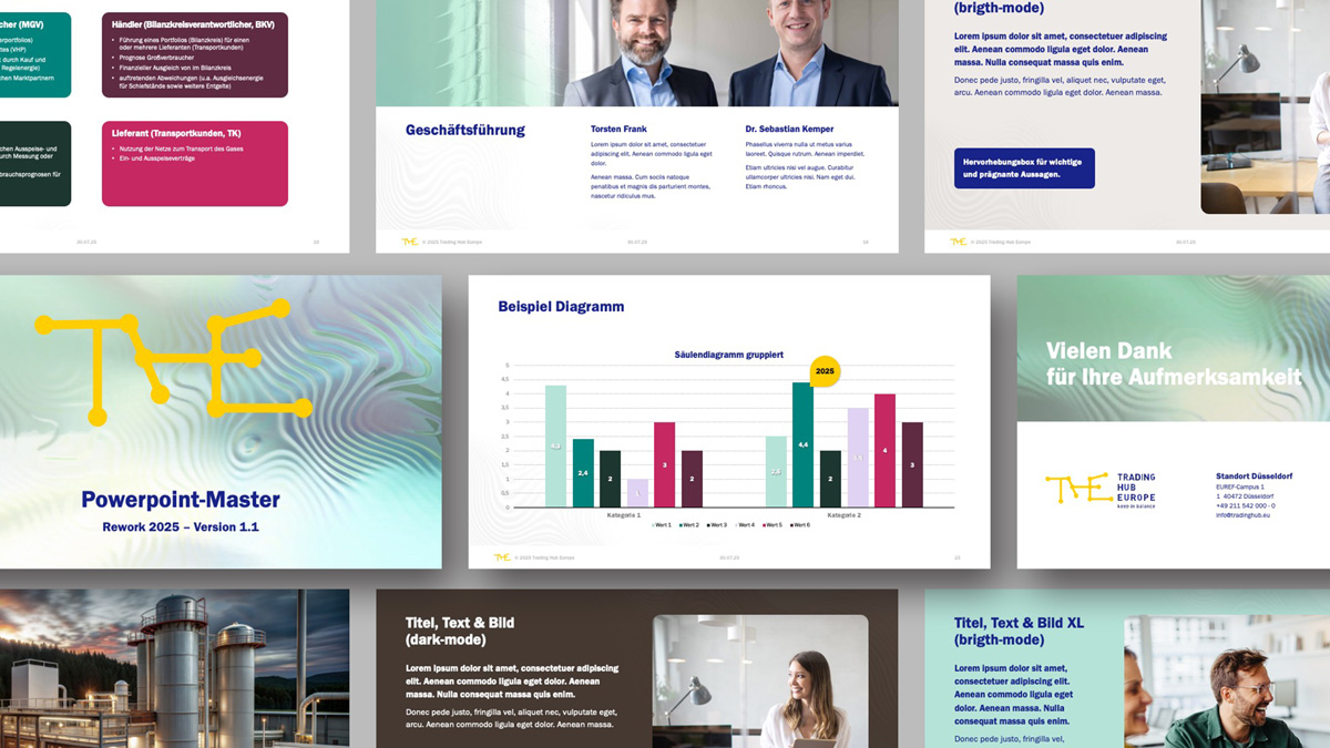
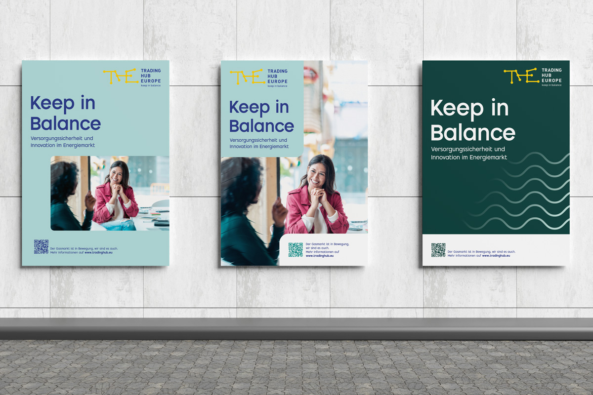
The updated colour palette, comprising primary and secondary colours, supports a flexible multi-colour design that cleverly combines light and dark variants. The optional dark mode design enhances digital usability and emphasises the brand’s professional character.
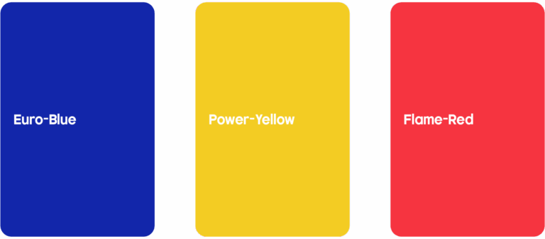
THE- Primary colours
TRADING HUB EUROPE’s colour scheme continues to be based on the logo colours and is complemented by a coordinated secondary palette. The primary colours form the basis and ensure brand recognition, whilst the secondary colours are used more extensively to enable differentiation and theme-specific design. A high proportion of white ensures a fresh and modern look. Where necessary, the colours may be halftoned in increments of 10.
Systematic design.
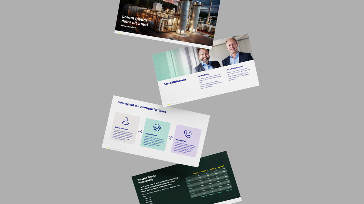
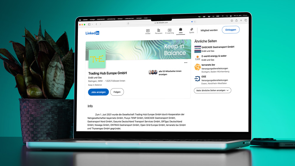
The grid system, typography, visual language and iconography have been revised, expanded and systematically organised. Striking social media templates have been created for LinkedIn and META, which convey messages in a visually powerful, high-contrast and emotive way. A consistent image preset ensures brand and stylistic consistency across all media.
A key visual with symbolic power.
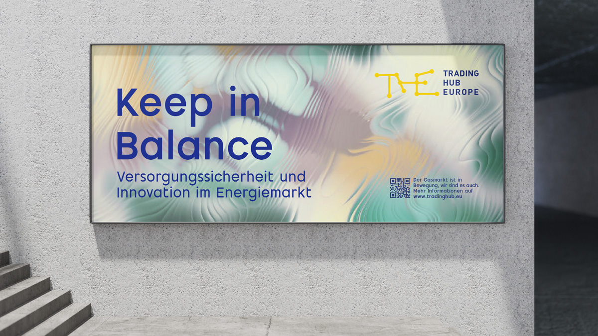
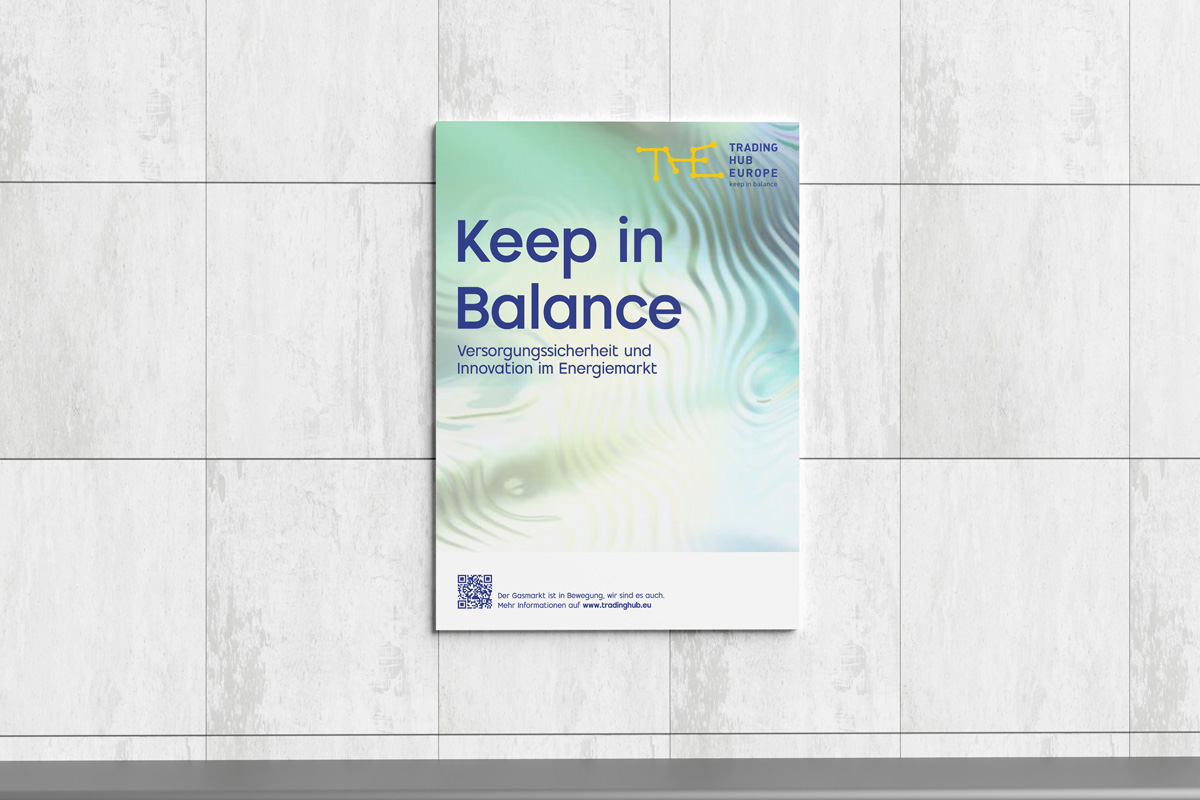
The new ‘Trading Waves’ theme is inspired by natural ripple marks – delicate patterns created by currents. This visual metaphor translates the dynamics of the gas market into a graphic system: energy flows, market movements and the constant balance that THE ensures.
UX Concept & UI Design – A fresh approach to user guidance.
In parallel with the corporate design, a new UX concept was developed for the website. The information architecture was restructured, prioritised and made more accessible – with clear navigation paths for different target groups, ranging from market participants and policymakers to the interested public.
On this basis, a modern UI design was developed that consistently translates the new corporate design into the digital realm. Clear typography, a defined use of colour schemes, multicoloured
Keep in balance
A comprehensively modernised corporate identity that clearly showcases Trading Hub Europe’s values – reliability, stability and innovation. As a further development of our original design, it forms the basis for consistent brand management – across print, digital and all communication channels.